Enjoy this article?
Most Museums Journal content is only available to members. Join the MA to get full access to the latest thinking and trends from across the sector, case studies and best practice advice.


The Natural History Museum (NHM) has rolled out a new brand identity inspired by its ambition to become a catalyst for change.
The redesigned logo and colour palette have been rolled out across the institution’s digital platforms and physical locations this week.
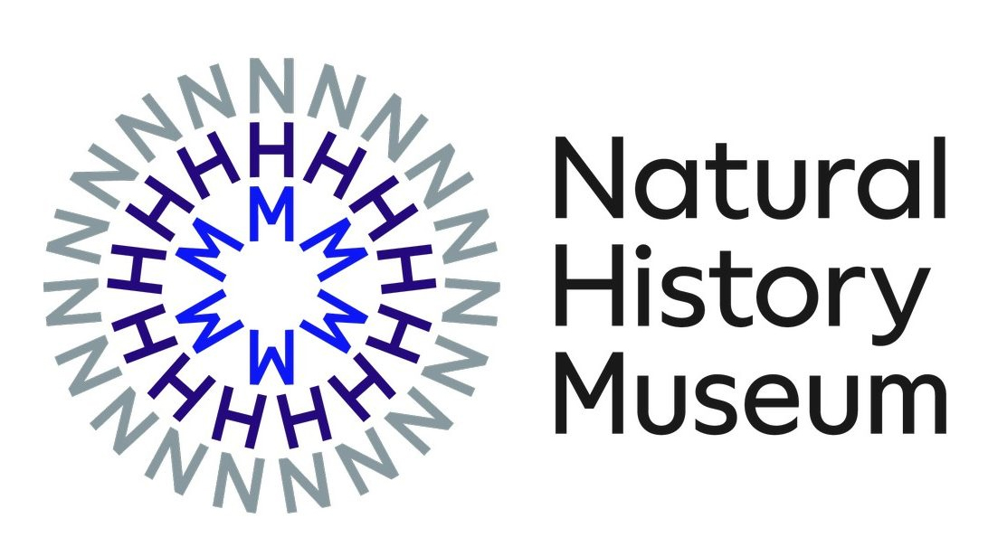
The new logo features the initials NHM in concentric word rings inspired by circular patterns in nature and “the energy of a ripple effect”.
This symbol can be static or moving and is intended to be “the visual representation of a catalyst” – the rings can pulsate, expand, change form and communicate, and are intended to create a sense of dynamism and energy.
The museum’s head of marketing, Richard Orr, and head of public space programme, Lucy Clark, led on the project.
“With a bolder and more contemporary voice the new brand positioning can better engage both existing and new audiences and help us highlight how the museum is finding solutions to the urgent issues that face our planet,” said Orr.
Clark said: “With dynamism and motion at its heart, our new brand reflects the catalytic power of our collections, world-leading scientific expertise and enormous audience reach.”
The museum worked with the creative agencies Heavenly, Pentagram Design and Nomad Studio on the project, supported by its internal design, marketing and digital teams.
The rebrand commenced with the creative consultancy Heavenly, which developed a comprehensive brand strategy programme, establishing a “new and distinct” narrative to inform the brand tone of voice and overall visual identity.
Pentagram and Nomad combined as one team to interpret the brand strategy developed by Heavenly.
Marina Willier, partner at Pentagram Design, said: “Our team created a mindset shift from passive catalogue to active catalyst – creating advocates for the planet. More than museum, more than history, a pioneer in science and advocacy, at a crucial inflection point in time.”
Pentagram and Nomad also defined the brand logic, with the symbol working in combination and uniting all of the museum’s sites, including South Kensington, Tring and its new scientific facility, which will be located at the University of Reading’s Thames Valley Science Park. The initials NHM can connect to the long form name in different compositions for the various museum locations and parts of the offer.
For the easy creation of patterns and word rings, the team also created a Generator, a tool that can be used to design both static and motion outputs through coding, making it easy for designers working with the brand to maintain consistency and flexibility.
Most Museums Journal content is only available to members. Join the MA to get full access to the latest thinking and trends from across the sector, case studies and best practice advice.
You must be signed in to post a comment.
Looks highly reminiscent of the old 1970’s BBC Nationwide programme logo. That also span around in a dynamic way at the start as I remember. Good effort though and probably bang on trend.